Defining Key Visual and Designing Interface For Kahf Decode
The Company: Kahf
Kahf dominates Indonesia's men's skincare market with 39% market share (Shopee, Q1 2025), making it the category leader.
Their brand is built on consistency: from typography with their own custom typeface (Kahf Sans), to product packaging, to social content and influencer partnerships, every detail is intentionally crafted. For Kahf, beautiful design isn't just functional, it's a core brand differentiator.


The Product Digital: Kahf Decode
Most Indonesian men are new to skincare. They're unsure of their skin type, which products suit them, or where to start. This uncertainty creates hesitation at the point of purchase process. Kahf Decode bridges that gap by providing personalized guidance, turning confusion into confidence.
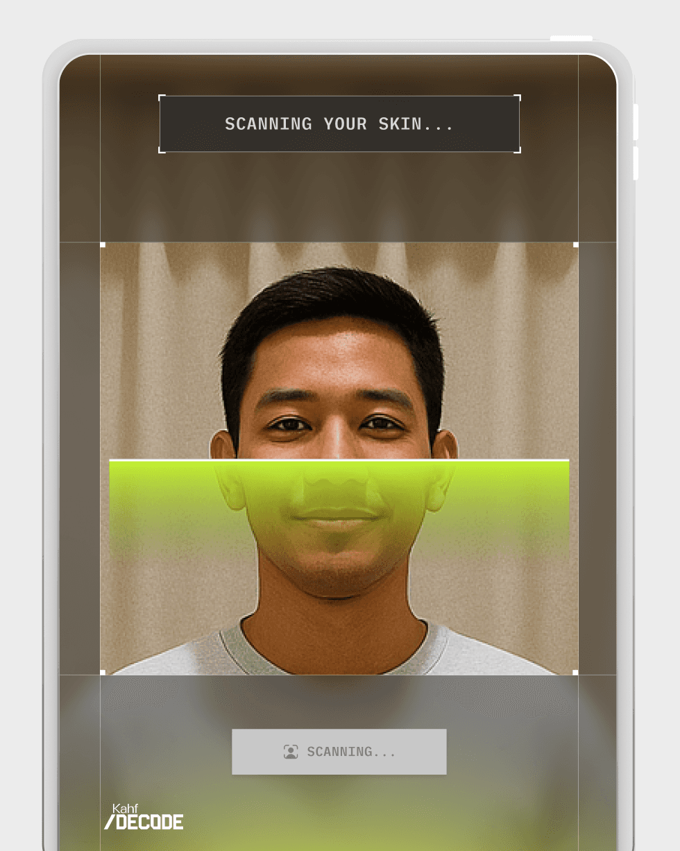
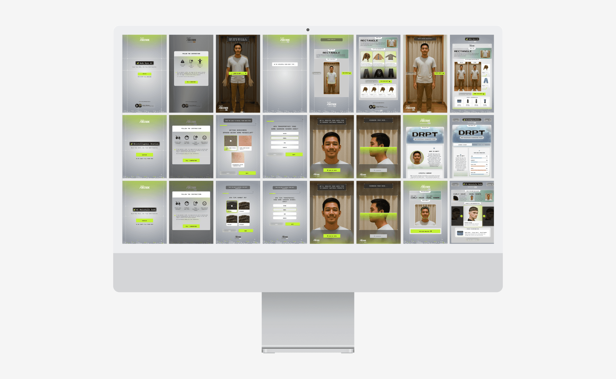
Kahf Decode is an AI-powered diagnostic experience that helps men discover their ideal skincare, hairstyle, and outfit recommendations. Launched as an offline event activation, it combines computer vision and personalized algorithms to simplify grooming decisions and build user confidence.

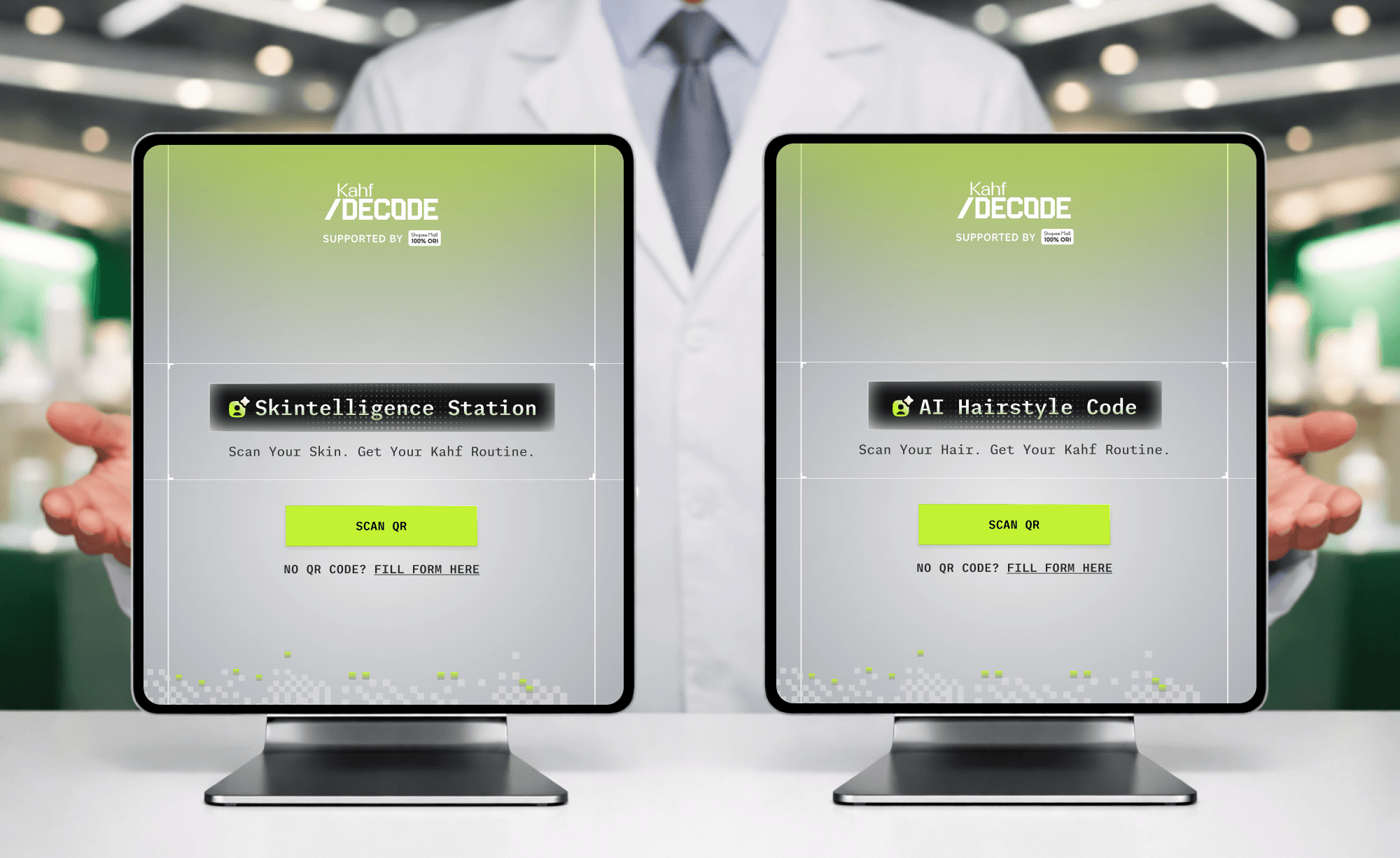
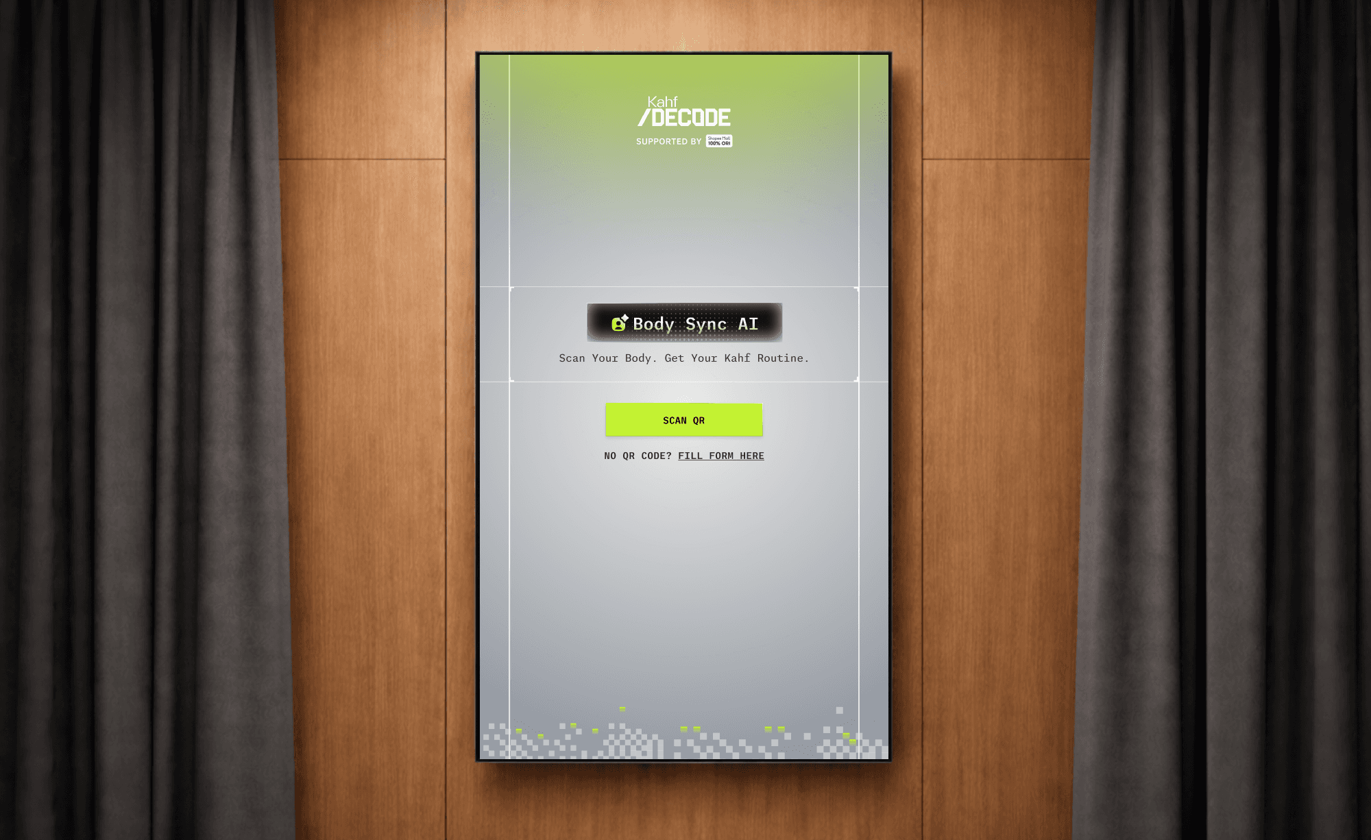
3 products that we designed are

Skintelligent Station — Analyzes skin type, identifies common problems, and recommends suitable Kahf products.
AI Hairstyle Code — Detects face shape and suggests complementary hairstyles.
Body Sync AI — Identifies body type and provides outfit recommendations.
Background & Problem
Kahf had invested heavily in Decode's launch: a flagship event at one of South Jakarta's most prestigious malls, targeting Indonesia's urban affluent consumers. The event was supported by high-profile KOL partnerships and integrated marketing across social, web, and offline channels.But with just three weeks until launch, the initial designs from an external partner hadn't met expectations. The interface design felt disconnected from Kahf's premium visual identity. For a brand where every touchpoint is intentionally crafted, launching anything less would undermine the entire brand experience.
I was brought in to redesign all three digital products in three weeks, ensuring they matched the quality Kahf delivers across every other touchpoint.
Objective
The redesign had two priorities: first, establish a key visual direction that feels expert-made and aligned with the lifestyle Kahf represents.
Second, ensure strong usability through seamless user flows and clear information architecture, so users can navigate the experience effortlessly.
The Key Process
1. Understand the product, the users, the company vision and run a UX audit
Before any visual exploration, we focused on identifying three core issues: usability problems, information architecture gaps, and user flow. I believe beautiful design should be useful, so these are non-negotiable when designing a seamless experience.
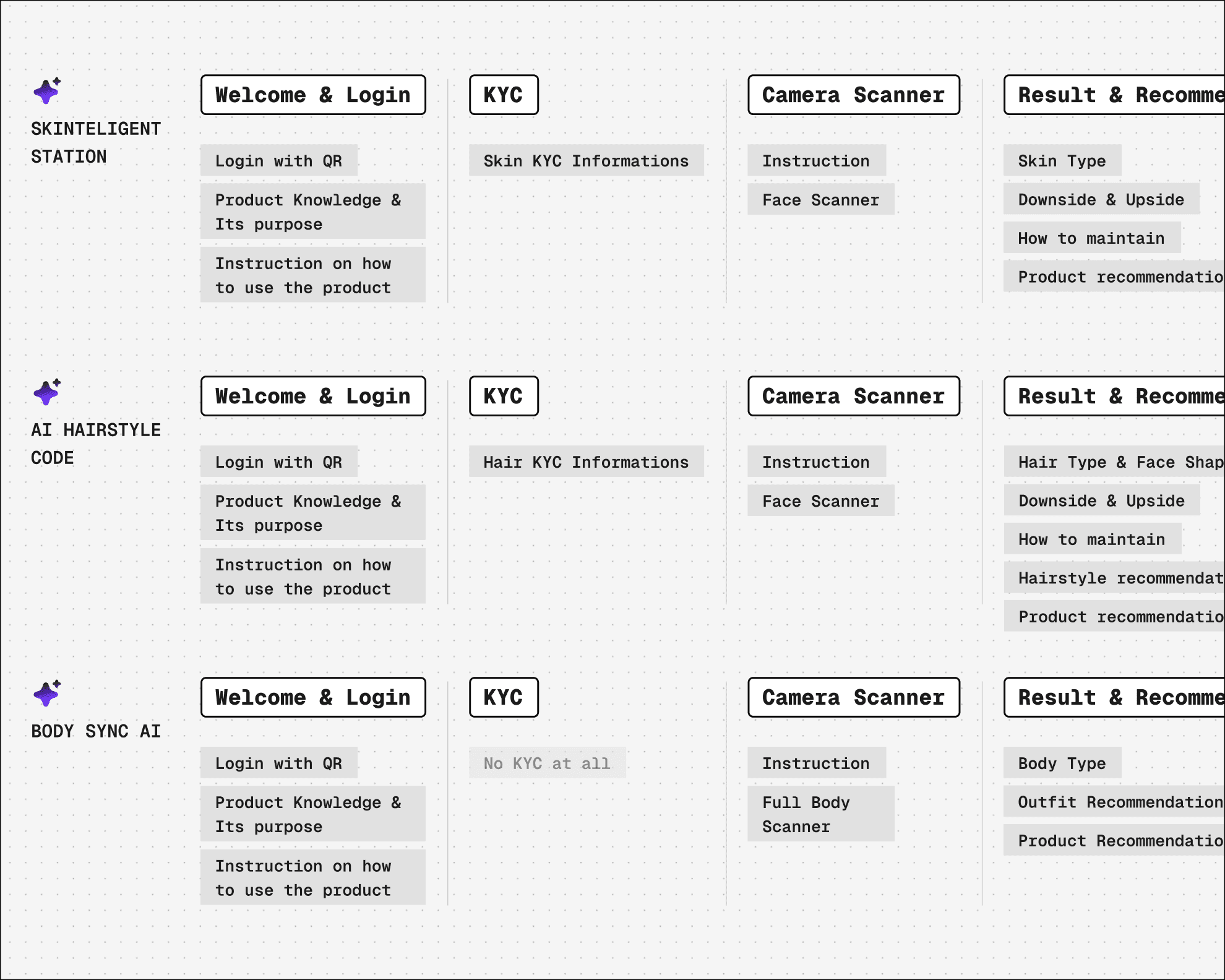
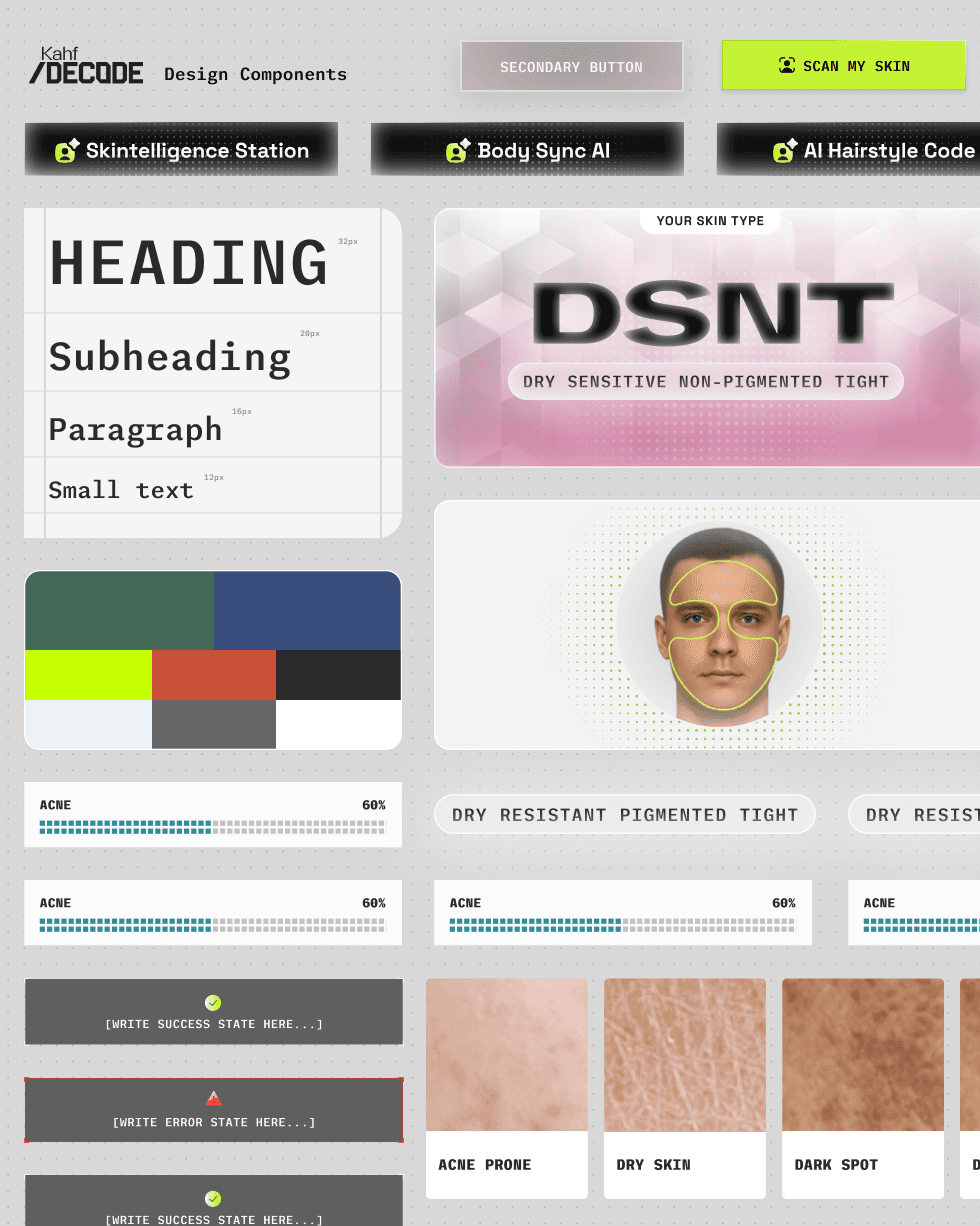
We unified the user flow and information architecture across all three products, allowing users to navigate each experience with the same intuitive pattern
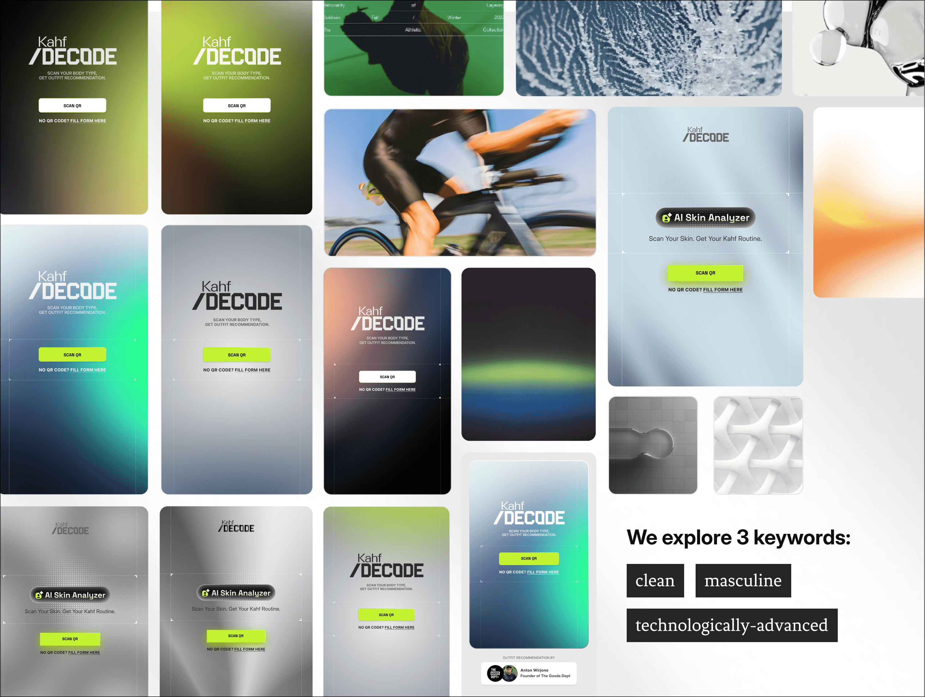
2. Explore visual directions
After identifying problems and proposing solutions, we moved to the main expectation: exploring beautiful interface designs.
Like writer with blank paper, painter with their blank canvas, to us defining key visual is also the most challenging because the possibilities and options so enormous. We started with key visuals, and since color is the biggest element that evokes mood, we explored two extremes. Some stakeholders preferred vibrant colors, the others wanted muted tones.
We choose home screen because it is the most expressive medium, the other screen like login sign up camera scanner, it’s the most functional thing. Then we implement the color & mood to the home screen, and ask their feedback which one is the most interesting, the ugly one and fit with the Kahf branding. By doing this we collect the feedback & iterate effectively.
3. Designing Interface & Doing Design Review
This was the most challenging part. Four stakeholders held executive decision power, each with different knowledge and taste. One referenced Digimon card designs. Another wanted a futuristic interface like Iron Man's HUD. Aligning these visions under a 3-week deadline required a deliberate approach
My strategy to navigate this gap knowledge and preferences (situation)
First approach, we proposed our recommendation based on what we believed was relevant to Kahf, grounded in their existing design system, key visual documentation and the industry standard.
Second approach, we designed options based on their direction, showing we listened and genuinely tried their ideas. Then we explained why those directions conflicted with their own key visual guidelines.

80% of time
Spent for exploring design ideas (both our ideas & stakeholders ideas), articulating design decision and conducting design review
483 design draft
We believe in order to get the best ideas is to explore as much ideas as possible, that’s why we heavily invested in exploring multiple design alternatives
The process leads to confidence on presenting design to the users